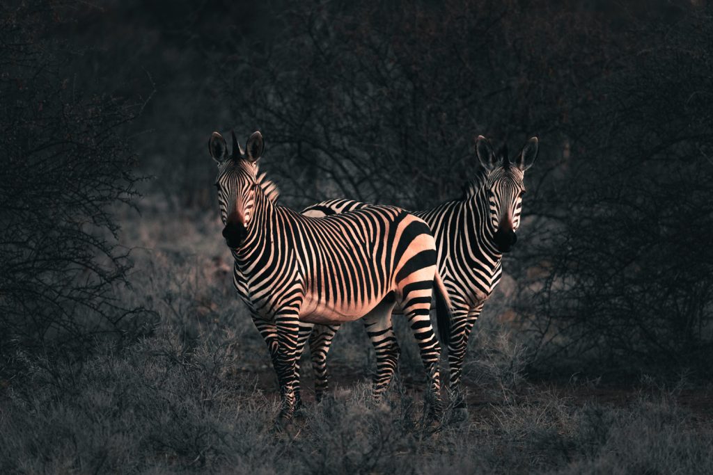
For many, wildlife photography is all about natural colors and objective realism. The light, composition, and behavior captured should do all the talking. And for the most part, I agree — for that other tiny little bit, though, I beg to differ. Please allow me to elaborate in more ways than one.
It’s Not the Size of the Lens That Counts, It’s How You Use it
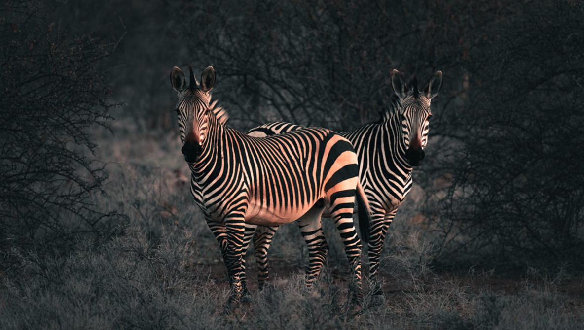
I shoot most of my wildlife images with the Sigma 150-600mm Sport. At 600mm, the widest aperture is f/6.3 — not amazing, but when you consider the range and the price point, few others come close. So, to compensate, I need to bump up that ISO. For static subjects like the zebras in this shot, one can afford to slow down the shutter speed if stability isn’t an issue. In general, if you’re shooting handheld, doubling the number for the shutter speed in relation to the focal length is the accepted guideline. The Sigma’s optical stabilization is fantastic, however, so I could have a shutter speed half the recommended setting, and it would still be sharp. Thankfully, for this shot, I was able to balance the hefty lens with my elbow and knee, so I was able to get the shutter speed down to 1/250th. Even at 600mm, the shot still turned out sharp — well, as sharp as can be expected at ISO 1,250. Yes, ISO 1,250 is high, and the Canon 6D Mark II isn’t exactly a low-light beast.
Some photographers wouldn’t even bother taking the shot at these light levels. Clarity of detail is paramount for a lot of wildlife photographers, and it’s understandable. Each species has unique fur, scales, skin, or feathers, so exaggerating these features should be one of your main goals when photographing animals. For me, however, there is a quality which trumps all that: emotion.
Now, I don’t mean to get all soppy on you, but as a visual storyteller, my main goal is to get the viewer to connect with the subject, so if I feel that there’s a certain “moment,” I don’t care how I capture it. Obviously, there’s a limit: a giraffe starts looking like a lanky leopard at ISO 16,000, but for all intents and purposes, a zebra is a zebra at ISO 1,250. It may ba a slightly soft zebra from a 90s TV show, but If it’s a nice scene or moment, I’m taking the shot.
The Edit
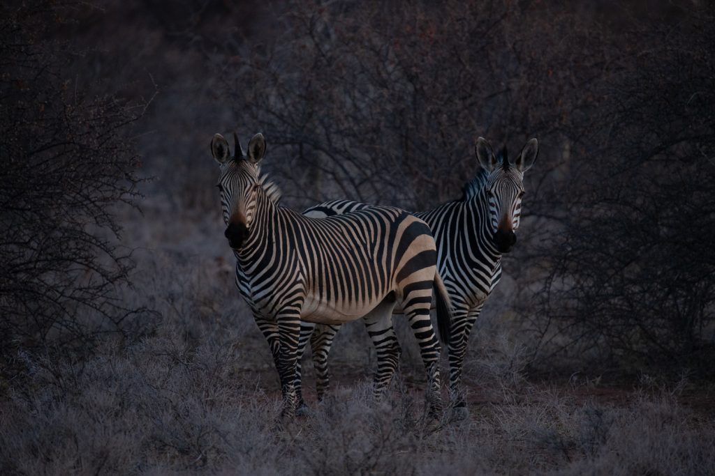
I knew that I had a bit of work to do in post, as the image was about two stops underexposed. The back of the camera screen is always a little flattering, so it’s important to check the histogram to get an accurate representation of the shot.
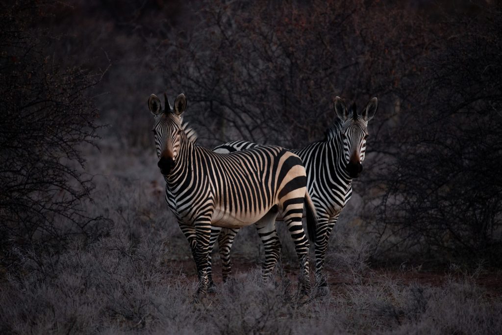
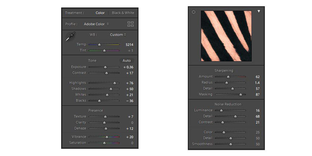
Base Exposure and Temperature
I loved the soft, post-sunset glow highlighting the animals. The dark frames of the the shrubs either side and behind the zebras made them stand out even more. I wanted to emphasize this, so I increased the highlights while also bringing the shadows up to reveal more detail. I could have just raised the exposure, but I like to mess around with the highlights, shadows, whites, and blacks first. After a little back and forth, I settled on a base exposure. Next came the temperature. I had my camera on auto white balance, so the image came out a little cold. I liked the coldness of the surroundings, but I wanted to warm up everything first. After warming it up, I took the blue hue completely off of the animals by selectively reducing blue saturation. I’ll add more coolness to the surroundings while I’m doing the overall color grading.
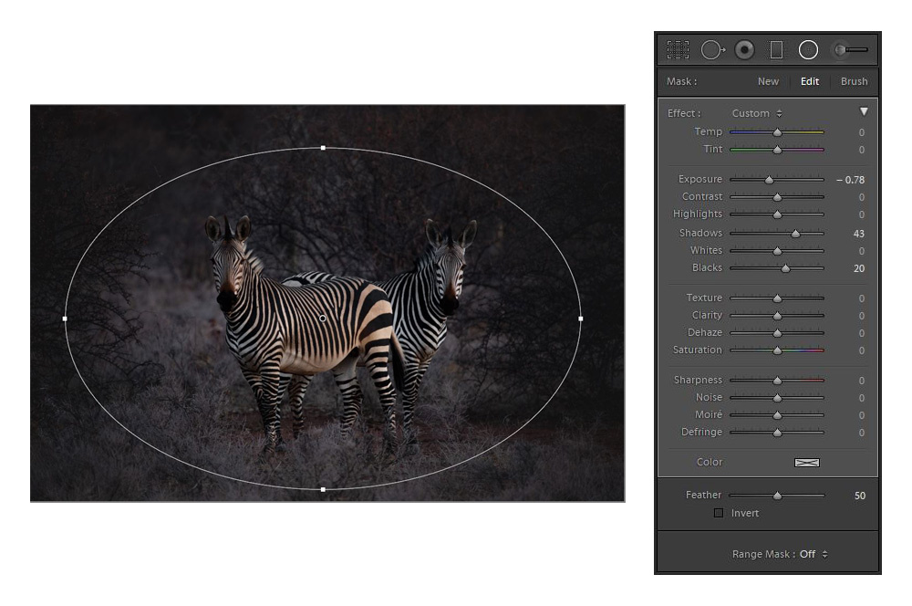
Make Them Pop With A Radial Filter
I wanted to isolate the zebras even further without making the edges too dark, so I used one of my favorite tools in Lightroom for wildlife editing: the Radial Filter. I use this instead of the vignette effect, because I find Lightroom’s vignette function a little heavy-handed for my liking. Lightroom’s feather and range masking options for all its tools are great for getting a more subtle effect, but I felt that I didn’t need to use them here.
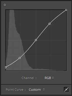
Curves
I would suggest that (at least) because of the lack of detail in this image, it certainly won’t win any awards. In order to get a good score from a judge at a competition, detail and sharpness are adjudicated in their own sections (depending on the specific competition criteria), so if you want to score high, submitted images need to be of an extremely high standard. Why bother with this image if that’s the case? All I can say is that I just like it.
So, the image lacks detail, but I want to post it to social media or use it for my portfolio. What do I do? It’s a sneaky tactic that many seasoned editors will see through. I raised the black point to create a slightly faded look, and I introduced some more contrast by creating a slight S curve.
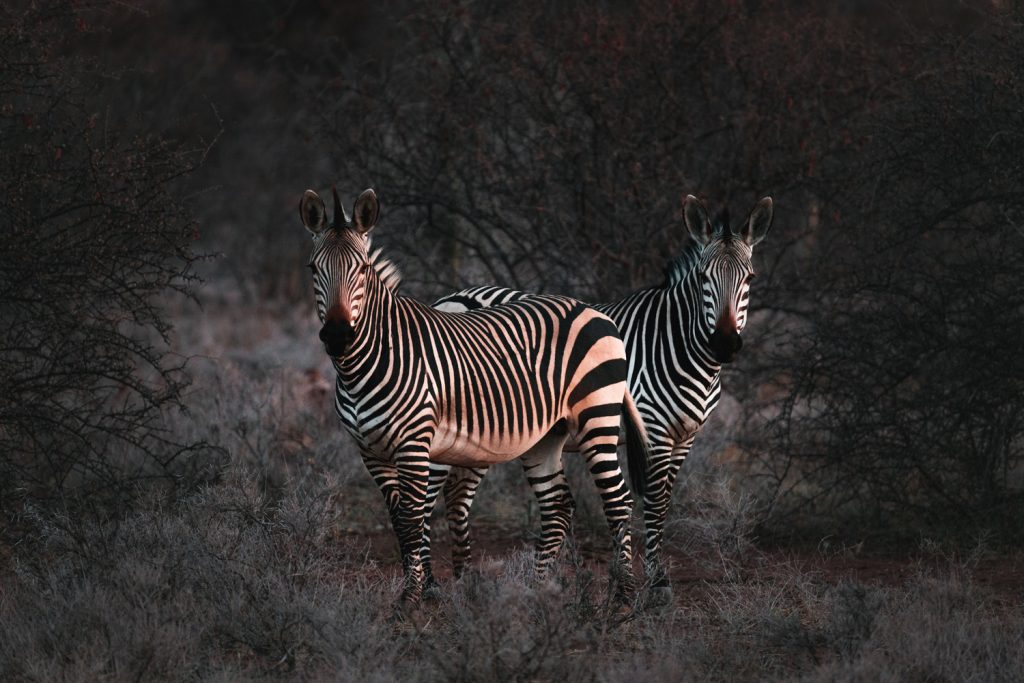
And here’s a before/after:
It’s subtle, but effective. Almost like I meant to capture a slightly old looking image, eh?
Getting Creative With Color
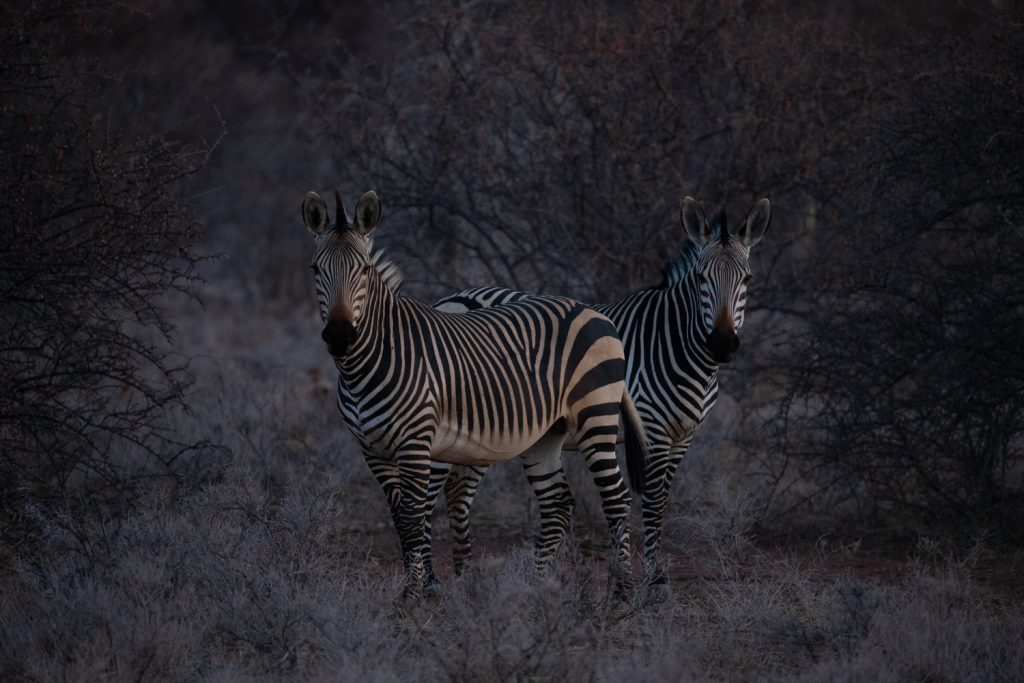
From here, I started to experiment a little. It’s not easy to tell from the raw image, but the zebra in the front was covered in a light layer of orange dust because of the dry and windy weather. I wanted to emphasize that while also cooling down the surroundings in order to get some nice color contrasts to complement the contrast in luminosity between the animals and the background/foreground. There are numerous ways to do this, but the lazy way is my go-to: split toning. Yes, amber and teal is done to death, but I just wanted a tiny bit.
The actual values for my adjustments aren’t important, as every image will require different tweaking to get a similar result, but it’s helpful to have an idea of what I was doing if you’re new to Lightroom.
After split toning, I went wild with color calibration. There’s no exact science to how I approached this, I’m afraid: I started moving sliders until I got what I wanted. I really liked the slight green/aqua tint that was introduced with the split-toning. I think it complemented the red/orange of the dust on the front zebra, so I wanted to see where I could go with it. Shifting red primary to the left really exaggerated this, which I liked. Moving green primary to the right took some yellow out of the animal’s hide, but more importantly, it took a yellow tint out of the shrubs and trees. Shifting the blue primary to the left again exaggerated this red/green look I started leaning towards, but I felt it was too nuclear-looking. so I decreased the saturation a good bit. I then dragged the shadows tint towards green in order get rid of more purple. If you now look at the Color Saturation panel, it’s easy to see how I approached color with this image. Most of those adjustments are doing very little, however. Blue, magenta, and purple I found too distracting, so I all but killed them. The red on the zebra was far too saturated after all my tinkering and contrast adjustments, so I toned it down.
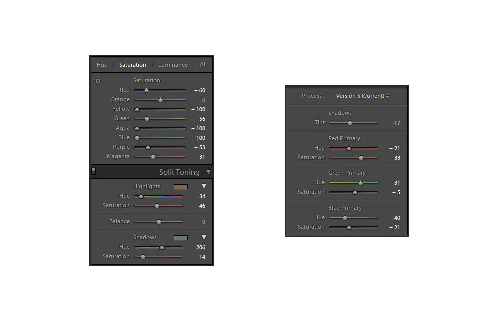
The most important result of these color adjustments is to further simplify the image. If you look at the last before and after slider, you should notice a lot of subtle blues and purples in the shadows. My aim is to always isolate my subjects as much as possible, and contrast of light is not the only method. It’s easy to go too far with creative color adjustments, especially with this type of photography, so a light touch is needed.
Final Adjustments
I added a bit of Dehaze and Clarity to make it pop a bit more. Then I made some final contrast adjustments, sharpness, and noise reduction after I remembered to turn check off “Remove Chromatic Aberration” and “Enable Profile Corrections.” You’ll notice that I masked the sharpness quite a bit. This was to completely remove some nasty grain from the out-of-focus background. Not ideal, but there was little detail in the animals’ coat to work with. The sharpness is now only affecting the areas of high contrast. I didn’t go too far with noise reduction, because it will completely destroy what little detail is there; I need to live with a bit of grain, which is fine in this instance, because it’s a dark image.
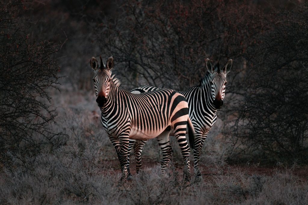
Final before and after image:
Final Thoughts
I may revisit this to tweak a few things, but for the moment, I’m happy. It’s always helpful to walk away from an image after an initial edit and come back to it with fresh eyes. If I were do something extra, it would be to add a slight Orton effect to the highlights and do all the sharpening and noise reduction in Photoshop.
This article is written by Mike O’Leary and appeared here.
All the images are collected from here.