Use the color gradient tool for a quick and easy way to color grade your photo in Photoshop.
You’ve snapped an awesome composition while you were at the coffee house, and you’re looking forward to doing the touch up and post-processing in Adobe’s Photoshop. You’ve made all of your adjustments to clarity, exposure, and saturation, but the image could use a little more “morning warmth.” Sure you could just adjust the white balance, but what about using a filter as if you were in Instagram?
Why don’t you try a gradient map in Photoshop, instead? Here’s how.
SEE: Choosing your Windows 7 exit strategy: Four options (TechRepublic Premium)
How to use a gradient map
- Go ahead and open your image inside of Photoshop.
- Follow your workflow of processing to handle exposure, clarity, and any other minor details of the image.
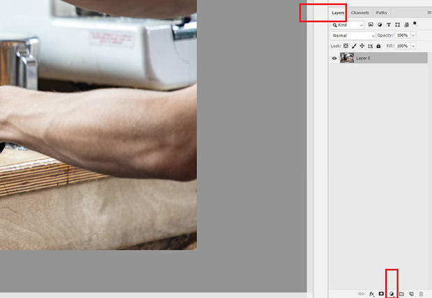
- When you’re ready, click on the adjustment layer icon in the bottom of your layers panel as shown in Figure A.
- Then select gradient map.
Figure A
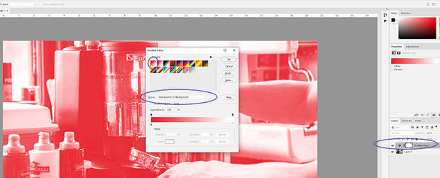
After you select the gradient map option, you’ll notice an additional layer (Figure B) in your layer panel. This is the gradient map adjustment layer. It should reside on top of your image layer. You’ll also notice that your image changes color. No worries. We’ll fix this.
To access the gradient map properties, double click on the gradient bar. This will allow you to pick the types of gradients as well as the colors to use in the gradient. I recommend using the “Foreground to Background” gradient.
Figure B
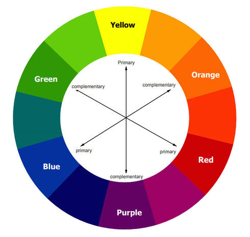
Notice that under each tiny box of gradient is a color tone. Each of those can be changed with a click to whatever color you’d like to use. In this example, I’d like to warm up my image since it’s a coffee house scene. Warm colors such as orange and red are ideal for use here, but the kicker is adding a complementary color as the foreground color.
Decide what favorite background color to use by adding it on the left of the gradient, then pick a complimentary foreground color for the right. Complimentary colors are found on the opposite side of the color wheel as seen in Figure C. For my example, I used orange as my background color, and I will choose a complementary shade of blue as the foreground color in my gradient map.
Figure C
EDraw
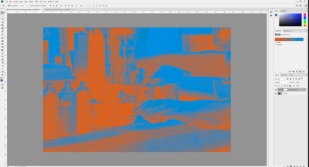
After you pick your colors for your gradient map, click ok. Unfortunately, your image will look quite odd (Figure D). But again, we’re not done. One more adjustment must be made.
Figure D
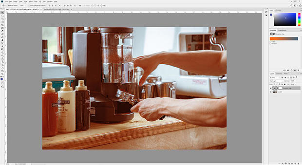
Note: you can make a change to the blend mode of your gradient map layer. Just select one from the drop-down box in the layer panel. (I recommend the Soft Light blend mode). Because we used the gradient map as if it were a filter, you can toggle the layer on and off to compare and contrast the looks between the original image versus the version with the gradient map applied. If you’re not happy with the output, you can always adjust the colors of your gradient map. Just click on it to mix and match the color scheme (Figure E).
Figure E
Photoshop has so many tools to help make the most of your photos, especially the gradient map. Tag me on Instagram with your favorite photos shot and processed.
Next Big Thing Newsletter
Be in the know about smart cities, AI, Internet of Things, VR, autonomous driving, drones, robotics, and more of the coolest tech innovations. Delivered Wednesdays and Fridays .
This article is written by Ant Pruitt and appeared here.
All the images are collected from here.